Our Approach
Discovery Phase
We conducted an accessibility audit and competitor analysis,
finding that most legal sites were 'static billboards' rather than 'functional assets'. Our
strategy shifted toward 'Digital Advocacy'.
Key Insights:
- Trust through Transparency: Showcasing victories clearly and
ethically impacts conversion.
- Accessibility as Inclusivity: Legal services must be accessible to
everyone, regardless of disability.
- Professional Authority: High-end typography and motion can elevate
brand perception.
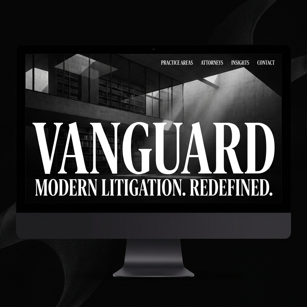
Strategic Direction
The 'Vanguard Standard' focuses on unrelenting preparation and
preparation met with aggression. We translated this into a bold, high-contrast digital
experience.
Design Language
We utilized a high-contrast visual system to command respect.
Large, confident headlines represent the firm's presence in the courtroom, while generous
white space reflects their clarity of thought.
Typography Palette
Playfair for Tradition
Inter for Accessibility
Design Decisions
-
Authority Typography:
Using 'Playfair Display' for headlines to evoke tradition, paired with 'Inter' for
modern readability.
-
Victory Showcases:
Modular sections designed specifically to highlight high-value wins with impact
and context.
-
Accessibility-First UI:
Guaranteed 4.5:1 contrast ratios and full keyboard navigation for every
interactive element.